
Let's talk about something that keeps product teams up at night: making your app feel truly local in every market it serves. While everyone's busy celebrating their global expansion, the reality of localization is far messier and more fascinating than most people realize.
The Uber Story: When Less Becomes More
Here's a story that perfectly illustrates why "one size fits all" is a myth in global product design. When Uber decided to tackle the Indian market in 2009, they quickly learned that their slick, map-heavy interface wasn't going to cut it. Now present in over 10,000 cities, their success wasn't just about expanding – it was about adapting.
The Birth of Uber Lite
Let me paint you a picture of the challenges they faced:
Complex GPS maps that didn't match local reality
Data-heavy interfaces in areas with limited connectivity
Western navigation patterns that didn't resonate locally
Their solution? Strip everything down to its essence. Uber Lite wasn't just a diet version of the main app – it was a complete rethinking of how ride-hailing should work in India.
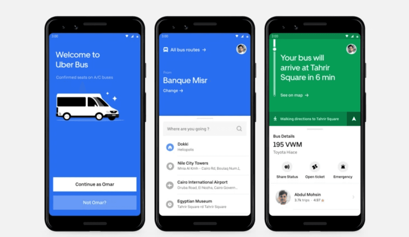
Instead of fancy maps, they went with something brilliantly simple: landmark-based navigation. Think "I'm near Central Hospital" rather than precise GPS coordinates. And those horizontal swipes we all take for granted? They switched to vertical scrolling because that's what Indian users preferred. It's amazing how something as simple as scroll direction can make or break user experience.
Colors That Speak the Local Language
Here's a detail that fascinates me: they completely rethought their color scheme. That iconic black-and-white Uber look? Gone. Instead, they opted for vibrant colors that guide users through the booking process. And look at that bus icon in the left photo – it's not just transportation, it's cultural relevance encoded in UI.
ASOS: When "Sneakers" Become "Trainers"
Now, let's talk about ASOS, because they're absolutely crushing it in the e-commerce localization game. Their approach proves that sometimes the smallest details make the biggest impact.
The Language of Fashion
Here's something that might seem obvious but trips up countless brands: the same product needs different names in different markets. A simple example:
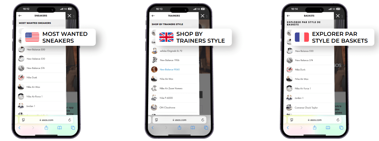
US stores: "sneakers"
UK shops: "trainers"
Product pages: Both terms where appropriate
But it goes deeper than that. ASOS doesn't just translate – they transform their entire content strategy for each market:
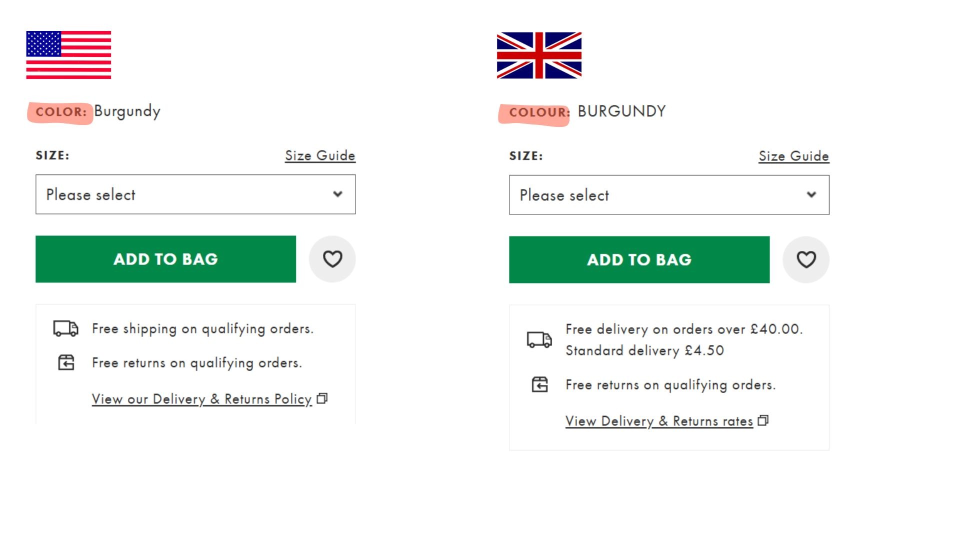
"Color" becomes "colour" for UK audiences
Holiday references shift (Thanksgiving vs. St. George's Day)
Even the humor gets a local twist
Best Practices: Lessons from the Trenches
Let's break down what actually works in localization, based on these real-world examples:
1. Prioritize Content and UX Adaptation
Don't just translate – transform. Like Uber's landmark-based navigation, sometimes the best solution isn't a translation but a complete rethink.
2. Invest in High-Quality Localization
This isn't just about budget – it's about dedication:
Time for proper cultural research
Resources for native linguists
Collaboration with local UX experts
Rigorous user testing in each market
3. Tools and Resources That Actually Help
At Gleef, we've seen firsthand how the right localization platform can make or break international success. Focus on tools that help you:
Create intuitive interfaces for each market
Boost conversion through cultural alignment
Build trust through authentic local experiences
Want to dive deeper? Check out our comprehensive guide in Global Success: 5 Keys to Successful Localization.
Detailed Implementation Guide
Let's get tactical about how to actually implement these lessons in your own projects.
Cultural Adaptation Checklist
Region-Specific Terms
Map out language variations (sneakers/trainers)
Document regional spelling differences (color/colour)
Create glossaries for each market
Interface Elements
Simplify complex features when needed
Adapt navigation patterns to local preferences
Consider local technical constraints
Visual Elements
Carefully select culturally appropriate images
Adjust color schemes for local meaning
Adapt iconography to local context
Quality Assurance Steps
Time and Resource Allocation
Cultural research phase
Linguistic adaptation
Technical implementation
User testing in each market
Expert Collaboration
Native language specialists
Local UX designers
Cultural consultants
Regional market experts
Testing Protocol
Field tests in target markets
User feedback sessions
Performance monitoring
Cultural sensitivity review
Strategic Objectives
When implementing localization, focus on these key metrics:
Customer Experience Enhancement
More intuitive local interfaces
Improved user satisfaction
Higher loyalty rates
Conversion Optimization
Better cultural alignment
Increased adoption rates
Stronger market performance
Brand Strength
Enhanced local perception
Stronger market trust
Long-term customer relationships
The Bottom Line
The success stories of Uber and ASOS teach us something crucial: localization isn't a checkbox to tick off – it's a fundamental approach to product design. It's about having the humility to admit that what works in one market might need a complete overhaul in another.
Ready to take your localization game to the next level? Our program might be exactly what you need. We're not just translating interfaces; we're building bridges between cultures, one user experience at a time.
Got a localization story – success or horror – to share? Drop it in the comments below. The best insights often come from those who've been in the trenches.